Background
I needed a simple solution for displaying accounting journal entries for articles belonging to my blog. While Bootstrap Tables can get you pretty close, I'm not relying on any external libraries or frameworks for this project beyond Django. My goal was to keep static assets light and dependencies to a minimum for both speed and the experience of give myself the opportunity to play with components I've generally farmed out to third-party libraries.
Furthermore, I don't just want a simple table layout. I want customized behavior specific to displaying accounting information where the account names for credit entries are rendered with an indentation. Because of my requirements, I put together a simple way to display accounting data without much overhead.
Goals
When complete, I want an HTML table with the following:
- Uniform padding of 10px (before javascript intervention)
- A header row with a distinct background color
- Row highlighting on :hover
- Borders demarcating the boundaries of the table as well as rows
- Table sizing and position (not shown below because it's an image); and
- Javascript to handle indenting credit rows
Altogether, this will look like:
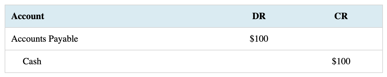
Implementation
First, we'll build a simple HTML table to use as our example journal entry using the data depicted above. It will consist of three rows where the first is the title/header row and the following two rows comprise the journal entry itself. Next, we'll style the table. And finally, we'll add a bit of javascript to indent the rows containing a credit entry.
HTML
The HTML Table will be a simple table element identified by a css class selector.
<table class="journal-entry">
<tr>
<th>Account</th>
<th>DR</th>
<th>CR</th>
</tr>
<tr>
<td>Accounts Payable</td>
<td>$100</td>
<td></td>
</tr>
<tr>
<td>Cash</td>
<td></td>
<td>$100</td>
</tr>
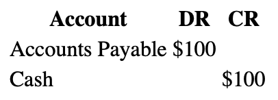
</table>When rendered in the browser with default styling, we'll have something like:
Now let's add the style to make the table a bit more visually appealing.
CSS
First, let's make the table 100% of its parent's width for small screens, center it with margin-left/right to auto and collapse table borders so there isn't space between the cells causing undesired spacing and background colors to appear separated.
table.journal-entry {
  width: 100%;
  margin-bottom: 5%;
  margin: 0 auto;
  border-collapse: collapse;
}
Next, let's add cell padding of 10 pixels as well as borders. For the borders, we want an outside border and borders separating rows. To accomplish this, we'll be applying borders only to the cells themselves (not the table element) and we'll query the appropriate <th>/<td> elements using the :first-child and :last-child pseudo class selectors.
table.journal-entry th,
table.journal-entry td {
  padding: 10px;
  /* rows & bottom border */
  border-bottom: 1px solid lightgrey;
}

/* left border */
table.journal-entry th:first-child,
table.journal-entry td:first-child {
  border-left: 1px solid lightgrey;
}

/* right border */
table.journal-entry th:last-child,
table.journal-entry td:last-child {
  border-right: 1px solid lightgrey;
}

/* top border */
table.journal-entry tr:first-child th,
table.journal-entry tr:first-child td {
  border-top: 1px solid lightgrey;
}
Next, we'll give the title row a background color, provide colors for row :hover, left-align the "Account" heading (<th> tags are center-aligned by default), and center-align the last two elements of subsequent rows that will contain our amounts.
table.journal-entry tr:first-child th  {
  background-color: #D6ECF3; /* twice as light as css default 'lightblue' */
}

table.journal-entry tr:first-child:hover th {
  background-color: #ADD8E6; /* css default 'lightblue' */
}

table.journal-entry tr:not(first-child):hover td {
  /* twice as light as css default 'lightgrey' */
  background-color: #E9E9E9;
}

table.journal-entry th:first-child,
table.journal-entry td:first-child {
  text-align: left;
}

table.journal-entry td:nth-last-child(-n + 2) {
  text-align: center;
}
To select the last two columns I'm using the pseudo selector :nth-last-child(). If you're already familiar with :nth-child(), it works basically the same but the count begins from the end of the parent and counts backwards. If you're unfamiliar with either, check out the docs I linked above and see below. They provide quite a bit of control.
Using my selector to grab the last two columns, :nth-last-child(-n + 2), the child elements beginning from the right/end will be selected with index [(-0 + 2 = 2), (-1 + 2 = 1)]. Pretty cool, right?
Next, let's add a couple media queries to shrink the journal entry on larger viewports. Journal entries aren't particularly large given they should only be comprised of three columns (account, debit, credit). Therefore, I want to keep the data closer together for readability.
/* small */
@media (min-width: 576px) {
  table.journal-entry {
    width: 80%;
  }

/* medium */
@media (min-width: 768px) {
  table.journal-entry {
    width: 60%;
  }
}
Note, the breakpoints I'm using here are Bootstrap's small & medium breakpoints.
Finally, let's bring it all together and add a couple variables where code is being repeated.
:root {
--cell-padding: 10px;
--border: 1px solid lightgrey
}
table.journal-entry {
width: 100%;
margin-bottom: 5%;
margin: 0 auto;
border-collapse: collapse;
}
table.journal-entry th,
table.journal-entry td {
padding: var(--cell-padding);
/* rows & bottom border */
border-bottom: var(--border);
}
/* left border */
table.journal-entry th:first-child,
table.journal-entry td:first-child {
border-left: var(--border);
}
/* right border */
table.journal-entry th:last-child,
table.journal-entry td:last-child {
border-right: var(--border);
}
/* top border */
table.journal-entry tr:first-child th,
table.journal-entry tr:first-child td {
border-top: var(--border);
}
table.journal-entry tr:first-child th {
background-color: #D6ECF3; /* twice as light as css default 'lightblue' */
}
table.journal-entry tr:first-child:hover th {
background-color: #ADD8E6; /* css default 'lightblue' */
}
table.journal-entry tr:not(:first-child):hover td {
/* twice as light as css default 'lightgrey' */
background-color: #E9E9E9;
}
table.journal-entry th:first-child,
table.journal-entry td:first-child {
text-align: left;
}
table.journal-entry td:nth-last-child(-n + 2) {
text-align: center;
}
/* small */
@media (min-width: 576px) {
table.journal-entry {
width: 80%;
}
}
/* medium */
@media (min-width: 768px) {
table.journal-entry {
width: 60%;
}
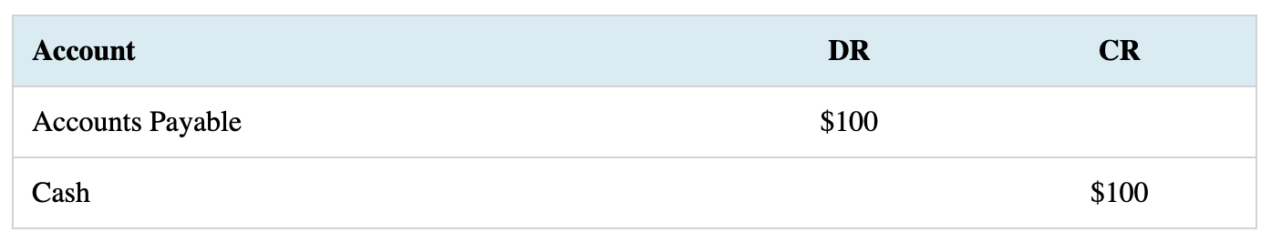
}With our style in place, the journal entry is nearly complete.
JavaScript
The final step to rendering the journal entry how I'd like is to use JavaScript to conditionally add padding to the first cell of rows other than the heading row and only if the third column is NOT empty but the second column IS empty.
To do this, I'll select all table rows after the first row, break out the first three cells, check if our conditions are met, and finally add the padding on the fly to the first cell if true. I want the padding to be of a certain minimum size so I'll capture the existing padding, triple it, and take the larger of this value and "25 pixels" as the padding to be used.
Finally, we need to determine when to run this function. The table needs to first exist, so we'll wait for the page to completely load by listing for the DOMContentLoaded event to fire. We'll nest our code within this event listener.
const rows = document.querySelectorAll('.journal-entry tr:not(:first-child)')

document.addEventListener('DOMContentLoaded', () => {
  rows.forEach(row => {
    const [first, second, third] = row.querySelectorAll('td')
    if ([first, second, third].every(Boolean)) {
      // make sure the elements we need exist
      first.textContent = first.textContent.trim();
      if (third.textContent.trim() !== '' && second.textContent.trim() === '') {
        // indent credits by set amount
        // first.style = 'padding-left: 2rem;'
        // do it dynamically instead
        const leftPadding = parseFloat(getComputedStyle(first).paddingLeft);
        // indent left the greater of atleast 3x existing padding or 25px
        first.style.paddingLeft = Math.max((leftPadding * 3), 25) + 'px'
      }
    }
  })
})
Finished Product
Here's a Codepen of everything together.
See the Pen journal-entry by Ian Waldron (@Ian-Waldron) on CodePen.
We now have a clean way to display journal entries with HTML, CSS, and Javascript. This code is available on Codepen.
Update
You might have noticed the journal entires on other articles looking different. I updated how JE's are displayed on my blog in May of 2025. Take a look at this Codepen to see how I did it.